
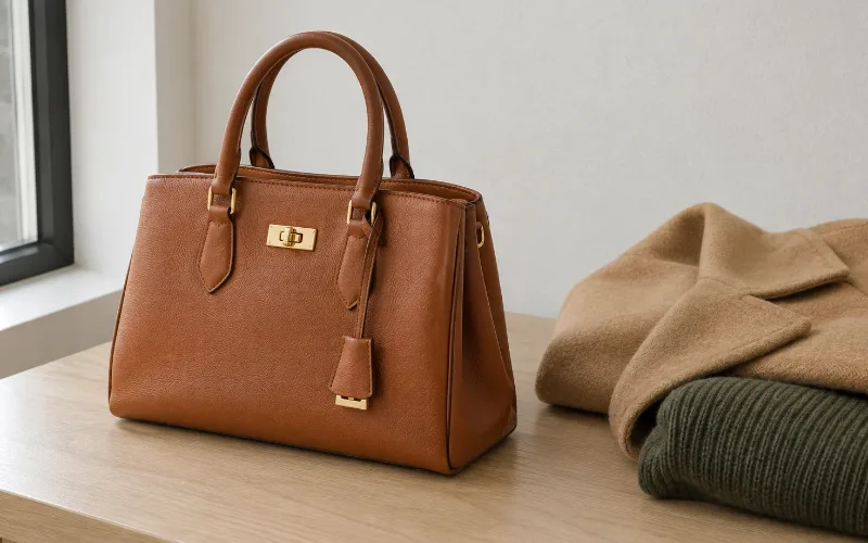
A handbag never gets near your face. That one fact changes the rule. You are matching it to the clothes you already own rather than to your skin, which makes your neutrals the deciding factor. It is also why the most flattering color on you can still be the wrong bag.
Most color advice is written for things worn at the collarbone. A bag sits at your hip, in your hand, or over a shoulder. Nobody has ever looked at your face and your handbag in the same glance.
A handbag color answers to your wardrobe, not your complexion
The handbag color question gets answered backwards almost every time. People run their season, find their best color, and buy a bag in it. But the color season analysis quiz gives you two lists, not one. There are colors that suit you. There are also neutrals to build a wardrobe around. For a bag, the second list is the one that matters.
Think about what the bag actually touches. It sits against your coat, your jeans, your work trousers. It never sits against your skin. So what colors look good on me is the wrong question here. The right one is what goes with the eight things you wear most.
Your season still picks the neutral family
Handbag color is not a free-for-all, though. Your palette already sorted your wardrobe into warm or cool neutrals. The bag has to live in that wardrobe. A cognac bag against a grey and navy wardrobe fights you every morning. Put the same bag against camel and olive and it disappears into the outfit, which is exactly what you want.
| Season family | Bag neutrals that carry everything | Hardware | Avoid as a first bag |
|---|---|---|---|
| Spring | Camel, tan, warm beige, light gold. | Gold. | True black. It outweighs the wardrobe. |
| Summer | Soft grey, navy, taupe, rose beige. | Silver. | Orange-based browns. |
| Autumn | Chocolate, cognac, olive, deep gold. | Gold. | Cool greys, which read flat beside warm clothes. |
| Winter | True black, charcoal, pure white, deep red. | Silver. | Camel and cognac. |
Treat the last column as a caution, not a ban. A first bag should be the one you reach for without thinking. The adventurous color is a second bag. That is a far easier purchase once the first one exists.
The leather decides how saturated that handbag color actually looks
Handbag color is decided by the leather as much as by the dye, and nobody mentions it. The same color looks different on different hides. Sotheby’s describes Togo as rich but matte, where the raised grain breaks up the light. Epsom it calls exceptionally luminous, its pressed grain holding colors vivid and crisp. On Swift, colors are said to glow from within, because the leather takes dye deeply.
So chroma is a leather decision as much as a color decision. That is the same chroma the quiz measures when it sorts you into bright or muted.
Which gives you a shortcut. If your palette runs muted, a color you liked on screen will probably be too loud on Epsom and exactly right on Togo or Clemence. If your palette runs bright, the reverse applies. Depth works the same way, and the skin tone chart covers that half. Box calf is the odd one out. It is semi-gloss and grows more luminous with age, so it suits classic neutrals better than it suits a statement.
| Leather | How the color reads | Suits which palette |
|---|---|---|
| Togo | Rich but matte. Raised grain breaks up the light. | Muted palettes. Soft Summer, Soft Autumn. |
| Clemence | Matte, with a velvety patina as it ages. | Muted palettes, and anyone wanting the color calmed down. |
| Epsom | Exceptionally luminous. Vivid, held crisp by the pressed grain. | Bright and clear palettes. Winter, Bright Spring. |
| Swift | Colors glow from within, because the leather takes dye deeply. | Clear palettes. Not for anyone who needs the color quieter. |
| Box calf | Semi-gloss and mirror-like. Grows more luminous with age. | High contrast palettes, and classic neutrals above all. |
Hardware is a smaller handbag decision than people think
Handbag hardware gets more attention than it earns. Gold or palladium is the question every guide spends paragraphs on. It deserves fewer. The metal is small, it sits far from your face, and it competes with a large area of leather doing the real work. Jewelry metals for skin undertones is the better place to settle your metal, because that is jewelry worn near the face where it genuinely changes how you look.
For a bag, match the hardware to the jewelry you already wear daily. Not for flattery. For coherence, so your watch and your bag are not arguing across the same photograph.
Where the handbag color rule stops applying
There is a point where handbag color stops obeying your palette, and cost per wear is what moves it. A seasonal bag outside your palette is harmless. You carry it twelve times and enjoy it. A bag you carry daily for a decade is a different calculation entirely.
Buying pre-owned changes it again. You choose from what exists rather than ordering a shade. That is the practical reality for anyone looking at a Hermes Birkin bag in Canada or anywhere else on the secondary market. The palette becomes a filter for a list you did not write. In practice that is easier, not harder, because the shortlist is already short.
The rule that survives all of this is simple. Buy the neutral first. Earn the color second.
Questions people ask about handbag color
What color handbag goes with everything?
The one that matches your own neutrals, which is not the same answer for everyone. Grey and navy go with everything in a cool wardrobe. Camel and chocolate do that job in a warm one. Black only goes with everything if black is already in your wardrobe, and for a lot of people it is not.
Should my bag match my shoes?
No, and that rule has been dead for years. They should sit in the same temperature family, so warm with warm and cool with cool. Beyond that, matching them exactly reads dated rather than coordinated. Related is the target. Identical is not.
Is black always a safe handbag color?
Safe, yes. Best, often not. Black is a Winter neutral and it outweighs lighter or warmer wardrobes, which is why a black bag can look heavy against camel or pastel. Charcoal, navy and chocolate do the same job more quietly.
Does the hardware have to match my jewelry?
It helps, but it is the least important decision on this page. If you wear gold daily, gold hardware keeps things coherent. Mixing metals deliberately is fine too. Nobody studies a bag clasp the way they study an earring, so spend the attention elsewhere.
Before you buy
Lay out the five things you wear most and put the bag color next to them. Not against your face. Against the clothes. If it argues with three of the five, it is the wrong color however much you like it. The same daylight rule applies as with fabric, so check it near a window rather than under shop lighting.
Then wait a week. A bag at this price is not an impulse. The shortlist will still be there. If you are unsure how to describe your own depth and undertone before you start, skin color names is the vocabulary, and a wardrobe built around what suits you makes every later purchase easier than this one.
How this was checked. The leather descriptions, including Togo reading rich but matte, Epsom reading exceptionally luminous and Swift colors glowing from within, come from Sotheby’s. Seasonal color analysis itself is a styling convention rather than a tested system, and this article does not pretend otherwise. The palette structure and terminology come from the Beauty Lies Truth color season analysis quiz. Everything about bag pairing reflects standard styling practice and is written as such.

BeautyLiesTruth publishes hair and personal color guidance built on primary research. Color claims are tested by draping under controlled daylight, and every figure is traced to a published source rather than to another blog.