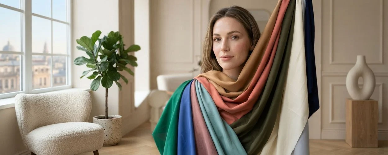
The colors that look good on you are set by three things: your undertone (warm, cool or neutral), your depth (how light or deep your overall coloring is), and your contrast (how far apart your skin, hair and eyes sit). Warm coloring suits camel, coral, olive and tomato red. Cool coloring suits emerald, cobalt, raspberry and true white. Neutral coloring suits soft teal, medium navy and dusty rose.
Four drape tests will place you. They take about ten minutes and need nothing you do not already own. Take the free color season quiz for a starting direction, then confirm it with the tests below.
How Do I Know What Colors Look Good on Me?
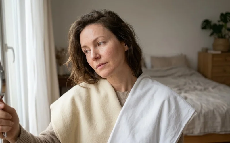
Run four comparisons beside a window in indirect daylight, with all artificial light switched off:
- Gold against silver: Whichever metal makes the skin glow indicates your temperature.
- Pure white against cream: Cool coloring looks brighter in white; warm coloring looks healthier in cream.
- Tired against glowing: Hold up two garments and watch which one makes the face look rested.
- Contrast check: Convert a photo to greyscale and measure the gap between skin, hair and eyes.
The direction that wins across more than one test is your working direction. A single test result is not enough to build a palette on.
Test 1: Gold or silver
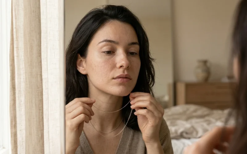
Remove makeup. Hold a plain yellow gold chain under the chin, then a plain silver one, and watch the jaw rather than the metal. One will settle the shadows under the cheekbones. The other will pull yellow or grey into the skin.
Rose gold returns a false neutral reading on people who drape clearly warm, so use untinted metal. This test says nothing about depth or contrast, which is why it cannot stand alone.
Test 2: Pure white or cream
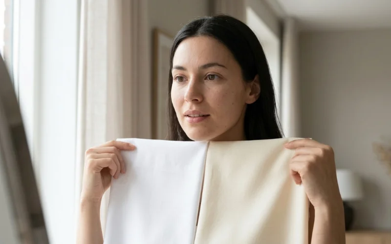
Alternate a white pillowcase and a cream one under the chin. Cool coloring looks clearer against pure white. Warm coloring looks healthier against cream and slightly grey against white.
This is the mechanism behind photographing badly in a white shirt. Match the two fabrics for weight and texture, because crisp cotton against soft knit changes surface reflectance as well as hue and the result becomes unreadable.
Test 3: Tired or glowing
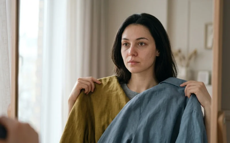
Hold up any two garments in different colors and watch the face, not the fabric. One will make the complexion look rested. The other will find every shadow, every patch of surface redness, every area of uneven tone.
That reaction is the whole subject. Every seasonal system ever published is a method for predicting it in advance.
Test 4: Contrast level
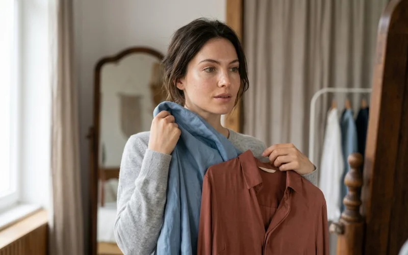
Photograph the face and convert the image to greyscale. Widely separated values mean high contrast, which carries clear saturated color well. Values sitting close together mean low contrast, where true black or bright cobalt tend to read as separate from the face.
Contrast is why two people with identical undertones suit different versions of the same color. Most online quizzes skip it entirely
What Should Warm, Cool and Neutral Undertones Wear?
| Warm undertone | Cool undertone | Neutral undertone | |
| Jewelry | Yellow gold | Silver, white gold | Either, rose gold |
| Best neutrals | Cream, camel, chocolate, warm navy | Pure white, charcoal, slate grey, true black | Soft white, taupe, medium navy |
| Best colors | Coral, rust, mustard, olive, warm turquoise, tomato red | Emerald, cobalt, raspberry, blue-red, lavender | Soft teal, dusty rose, jade, medium berry |
| Avoid near the face | Icy pastels, pure white, blue-based grey | Mustard, camel, bright orange | The extremes of either column |
Warm coloring is not restricted to orange and brown. Nearly every hue family contains a warmer and a cooler version. Warm coloring suits yellow-green over blue-green, and blue-red is the cool equivalent of tomato red. The family stays available. The version changes.
What Is a Skin Undertone?
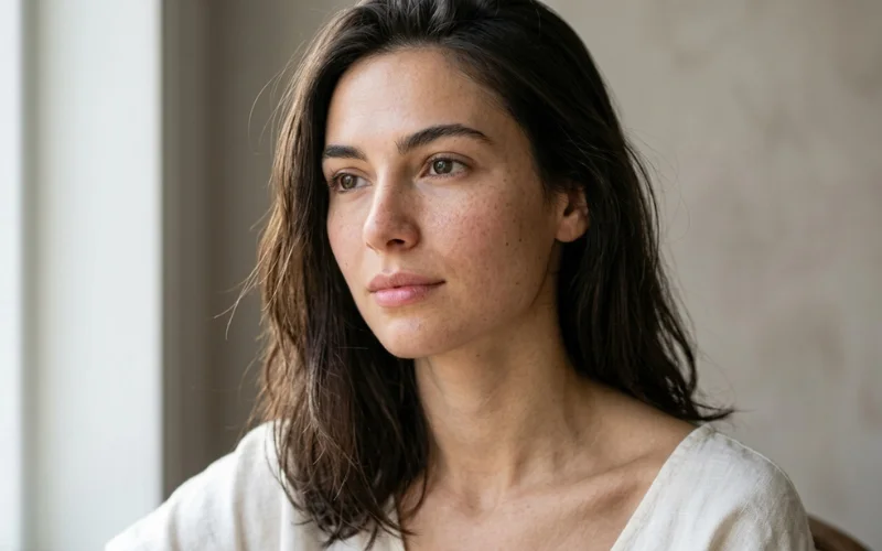
A skin undertone is the warm or cool cast produced by the pigments beneath the surface, and it stays constant for life. Dermatology literature published through the National Institutes of Health identifies the pigments responsible, called chromophores, as melanin, haemoglobin, bilirubin and beta-carotene.
Melanin sits mainly in the epidermis and drives depth. Haemoglobin sits in the dermal blood vessels and drives the pink and red cast. Carotene contributes yellow-orange. The visible warm or cool split is the net result of those proportions, which is why the effect is consistent rather than arbitrary.
Does a Suntan Change What Colors Suit Me?
No. Dermatology separates constitutive pigmentation, your genetic baseline, from facultative pigmentation, the temporary darkening caused by UV exposure. A tan alters facultative pigmentation only. Your depth changes and your undertone does not, so retest depth and contrast rather than temperature.
Anyone who re-runs the gold and silver test in August and gets a different answer has measured a suntan, not an undertone.
Does Lighting Affect Color Analysis Results?
Yes, and it is the largest single source of error in at-home testing. Two measurable properties decide it. Correlated color temperature, measured in kelvins, sets whether light appears warm or cool. Color Rendering Index, scored 0 to 100, sets how accurately that light reproduces color.
The U.S. Department of Energy puts the CRI floor for ENERGY STAR bulbs at 80. The Energy Information Administration notes that CRI measures how well a light source renders objects, materials and skin tonesv, and that lamps between roughly 2,500K and 3,500K carry the orange cast of incandescent light.
So a 2,700K bulb at CRI 80 and indirect daylight near 6,500K will render one complexion as two different skin tones. New Mexico State University’s Cooperative Extension guidance on determining personal colors reaches the same conclusion and states that analysis should be run under natural or incandescent light only, never fluorescent. In consultation this failure is routine. A client reads cool under salon strip lighting and warm beside a window ten feet away, with nothing about the client having changed.
The effect has a name. Metamerism describes two colors that match under one light source and visibly diverge under another. It is why a top matched to a skirt in a fitting room clashes on the pavement outside. Any drape test run under mixed lighting is producing a metameric result rather than a reading of your skin.
What Colors Look Good on Brown and Deep Skin?
Deep skin follows undertone the same as any complexion, and higher melanin density supports higher chroma. Warm deep coloring suits rust, marigold, cognac, warm ivory and emerald. Cool deep coloring suits fuchsia, cobalt, true red, icy lilac and pure white. Olive coloring suits warm neutrals, terracotta, tomato red and mid-tone teal.
Most consumer guidance is written to a fair-skin default and treats depth as though it were the undertone. Those are separate variables. Clinical practice classifies depth on the Fitzpatrick phototype scale, six types described by dermatologist Thomas Fitzpatrick in 1972, and reference material from the National Center for Biotechnology Information records Type III as the most common in the United States at 48%, with Types I and II together at 35%. That scale measures sun reactivity, not temperature. A Type III can be warm or cool, and so can a Type VI.
One correction worth making plainly: bright white against deep skin is one of the strongest combinations available, and a great deal of published advice tells readers to avoid it.
What Is the 3-3-3 Rule for Clothes?
The 3-3-3 rule means three tops, three bottoms and three pairs of shoes that all coordinate, producing roughly 27 outfit combinations from nine garments. It is a capsule wardrobe method rather than a color analysis method, but the arithmetic only works if all nine pieces sit within one temperature.
That is where most capsule attempts collapse. Nine individually appealing items, half warm and half cool, produce far fewer than 27 workable outfits. Settle temperature first, then choose the nine.
Can AI Tell Me What Colors Look Best on Me?
Partially. Photo tools read undertone and depth reasonably well from a clean, well-lit image, and they undercut consultation on price, which runs $150 to $500 in the United States and past $800 for premium studio packages. House of Colour, among the longest-running consultancies in the sector, states it has analysed over 100,000 clients across four decades.
The limitation is technical. Your phone applies automatic white balance before the image reaches the app. Warm indoor lighting shifts the whole frame, and so does a filter, a night-shift display setting, or a colored wall behind you. The tool analyses your camera’s interpretation of your skin rather than your skin.
Treat the output as a shortlist. If an app returns Soft Autumn, drape three characteristic Soft Autumn shades beside a window and check whether the face agrees. Under controlled light, the mirror is the better instrument.
What Colors Look Good on Men?
The same four tests apply and the procedure is shorter. The jewelry test runs with a watch. Contrast matters more than most men’s guidance admits: low-contrast coloring in a black suit and white shirt often reads washed out, and the fix is charcoal with a soft blue shirt rather than a different suit.
Beard color counts as part of the frame around the face. A warm ginger beard shifts the working palette the same way warm hair does.
What If the Tests Disagree?
Mixed results are common and do not mean the test failed. Either the coloring is genuinely neutral or olive, in which case temperature is not the dominant variable and depth and contrast should lead instead, or the test pair was poorly matched.
A faded pale blue against a deep saturated orange varies hue, value and chroma at once and tells you nothing about temperature. Repeat with fabrics matched for lightness and intensity. If it stays mixed, treat that as the finding: a broad working range is an advantage, not a defect.
How Do I Build a Color Palette I Will Actually Use?
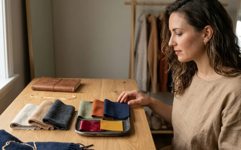
Build eight colors with defined jobs: three neutrals at light, medium and deep, three supporting colors realistic as a jumper or dress, and two accents for scarves, lipstick and bags. Photograph all eight together in daylight and keep the image on your phone.
That photo outperforms a season name in a shop, because a season name still leaves open whether a particular teal is the right teal. Color systems describe a shade through hue, value and chroma, the framework set out in Munsell’s color education material.
It is why “wear blue” is not actionable and “wear a mid-value, medium-chroma blue” is.
Hair forms part of the frame the fabric competes against, so retest light against deep after any significant color change. Texture affects how much light your hair returns to the face too, which the hair type quiz will establish.
The Caveat Most Guides Leave Out
A color that does not flatter your face is not banned. It is misplaced. Move it below the waist, into a bag, a shoe, or a print that also carries one of your neutrals. Put a scarf or collar from your working range between it and your jaw.
Clients regularly abandon a favourite color on the strength of a five-question online form. No method with this much documented variability justifies that.
Frequently Asked Questions (FAQ’s)
How can I determine which colors look best on me?
Run four checks in indirect daylight: gold against silver jewelry, pure white against cream fabric, a tired-or-glowing comparison of two garments, and a contrast check on a greyscale photo. The direction winning across more than one test is your working direction. Confirm by draping rather than by quiz result alone.
What is the 3-3-3 rule for clothes?
Three tops, three bottoms and three pairs of shoes that coordinate, giving about 27 outfits from nine pieces. It is a capsule wardrobe formula, and it only works if all nine garments sit within one color temperature, which is why color analysis comes first.
Can AI tell me what colors look best on me?
Reasonably well from a clean photo in indirect daylight. Accuracy drops sharply with filters, warm indoor lighting, colored backgrounds or heavy makeup, because the software reads your camera’s white-balanced version of your skin rather than your skin. Use it as a shortlist and confirm by draping.
How to figure out what color is best for you?
Settle temperature with the jewelry and white-against-cream tests, then depth by comparing a light neutral against a deep one, then contrast on a greyscale photo. Temperature narrows the hue family. Depth and chroma select the version of it.
What colors look good on brown skin?
Deep skin follows undertone like any complexion. Warm deep coloring suits rust, marigold, cognac, emerald and warm ivory. Cool deep coloring suits fuchsia, cobalt, true red, icy lilac and pure white. Higher melanin density supports higher chroma, so saturated color and bright white are assets rather than risks.
Does a suntan change what colors suit me?
No. A tan alters facultative pigmentation, the temporary UV-driven darkening, not constitutive pigmentation, your genetic baseline. Your depth changes and your undertone does not, so retest depth and contrast rather than temperature.
Why do my colors look different in the shop and at home?
Metamerism. Two colors can match under one light source and diverge visibly under another, because each source emits a different spectral distribution. Shop lighting and daylight render the same garment differently against the same skin.
Is black flattering on everyone?
No. On low-contrast coloring, true black can cut a hard line at the jaw and pull attention off the face. Charcoal, ink navy or espresso usually do the same job more softly. Deep and high-contrast coloring carries true black well.
BeautyLiesTruth publishes hair and personal color guidance built on primary research. Color claims are tested by draping under controlled daylight, and every figure is traced to a published source rather than to another blog.